Round and round…
Design trends change with the times and I love that. I often look around to see what other people are doing and in recent times one particular style has caught my eye, particularly within the surf scene. Circular logos.
According to Banksy, “most things look better when you put them in a circle“. Ok, it was tongue-in-cheek when he said it, but personally, I actually do like things in circles. Not quite sure why. Maybe it’s a sense of completeness.
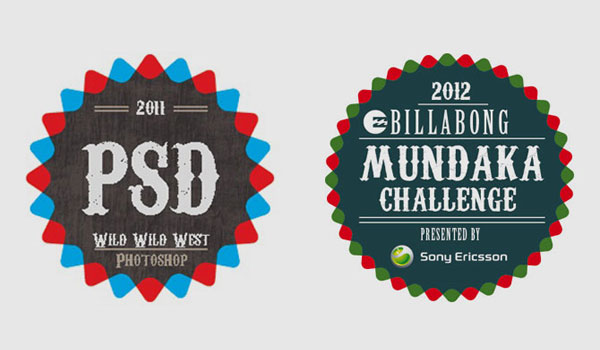
The Billabong Mundaka Challenge is underway in the Basque Country, sporting a funky stamp-like logo with a spaghetti western typeface and simple colours. It works. I like it. I wondered how they made it. Then I stumbled across a Photoshop tutorial and found my answer. (www.psdstation.com/tutorials/drawing/how-to-create-a-vintage-badge). When I find a logo like this and then realise it was made following a tutorial, it’s often a bit of a let-down. The design is somehow robbed of originality. But thinking about it more, when the pressure is on, tutorials like this can really help us save time, learn new skills and find a design solution that works. Naturally though, once the word is out, everyone starts doing it, and the once original design loses its flavour.

